Let's talk... Expanded & Wide Fonts

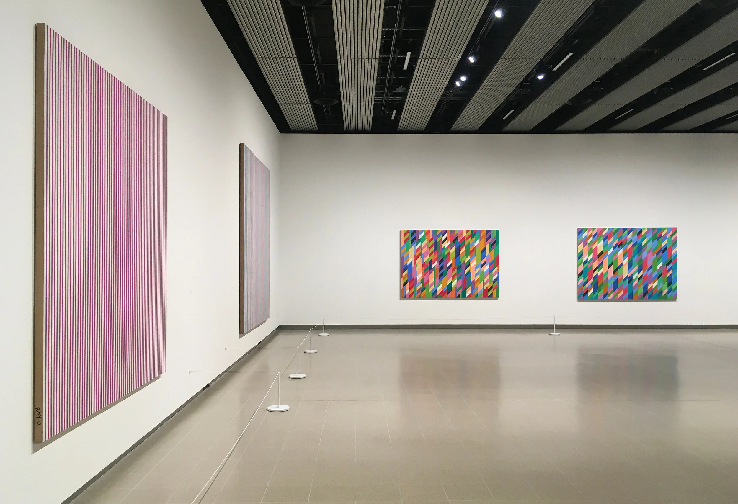
Who doesn’t love an extra wide font. They are sophisticated, relaxed and most of all, an absolute dream to design with. They look gorgeous, nostalgic, and when put in a mix with a regular version of the same or other typeface, they instantly grab the viewers (or perhaps just my) attention. So here’s a short list of some sans-serif typefaces out that I love along with anything else I felt could fit into this post.


Starting with Termina designed by Mattox Shuler. This montage couldn’t describe the font better; a font made to travel. An unfussy typeface that is at the tamer end of the how-wide-can-you-go scale. Below it looks even more sophisticated in white lowercase. The light weight sends me to first class bed heaven and bold is instructional and comprehensive.


Well hello there monsieur. Qu'est-ce que tu fais ce soir? Take me to a 1960’s french cocktail bar NOW. This font is called Obviously and is designed by James Edmondson and even just seeing the diacritic é mark in action truly makes me wish it was a part of the English language. The ever so slight rolling at the ends of the letters in the super weight above (as the designer marks the inspiration, ‘when the vinyl starts peeling up on the sides [of signage], and the corners are the only bits that manage to remain adhered to the substrate), you can envision this on old shop signages that have spent countless years being burned by the sun. It’s nostalgic of holidays and leaves you dreaming of life before smartphones and the open opportunity of spontaneity leading you into the night. The other weights below, are a lot less obvious in their inspiration but nonetheless they are divine to enjoy and work with. Obviously.


Input is an online tech publication, and their logo works perfectly as a simple example of mixing with different weights. Plus their body font, Monument Extended designed by Mat Desjardins, is a brutalist dream and demands your attention.


Continuing on with the mix of weights; the below created by Bart Vollebregt for Studio Dumbar, is simply satisfying and the Easy Ease of the motion from one position to another, is a joyous dance and celebration of all weights!


The below work by James Coffman is slightly less expanded, but the analogue print effect of the type along with the soft corners is authentic, traditional, and familiar. Check out their instagram for more.


Finally, spotted in East London, this estate signage is a classic example of wide type and the quirky jumps in baseline add character and look wonderfully smart on black.

Sound + Visuals 1

Gorgeous music visuals that happen to have a great track

Not only is this an incredible album to scoot to, I cannot get ENOUGH of this album artwork. The designer Jack Hardwicke says that the abstract symbols represent an ancient alien language. The justified symbols and off-black background are very sati…

Not only is this an incredible album to scoot to, I cannot get ENOUGH of this album artwork. The designer Jack Hardwicke says that the abstract symbols represent an ancient alien language. The justified symbols and off-black background are very satisfying. Along with the iconic Helvetica Neue Bold for the text top left - perfect.
Listen to the album on Spotify here

100000x100000-999-3.jpg

A trippy graphics video loop that is mesmerising. What more can I say?!

Above is the new album from Kelpe ‘If Not Now When’, which features unreleased tracks from 2010 to 2020. I’ve been following Kelpe’s music since I first heard a track of their’s in a Nokia N97 ad and I haven’t stopped since. The below artworks are s…

Above is the new album from Kelpe ‘If Not Now When’, which features unreleased tracks from 2010 to 2020. I’ve been following Kelpe’s music since I first heard a track of their’s in a Nokia N97 ad and I haven’t stopped since. The below artworks are singles pre-released before the album release and I love the scrapbook illustrative nature of the whole album artwork. And the music is just great to work or skate to.
Listen to the album on Bandcamp here

This piercing white circle and colourful gradient was enough for me to check out this album by Blutch. Pair it with the first track and it’s a blissful trip into an electronic journey through space. Listen on Spotify here

This piercing white circle and colourful gradient was enough for me to check out this album by Blutch. Pair it with the first track and it’s a blissful trip into an electronic journey through space.
Listen on Spotify here

The mix of these graphics is just perfection and so incredibly satisfying. Plus it’s a classic. 

Can we please just talk about... Peggy Gou's music video for Starry Night

This track came out earlier this year, and it’s unusual to see the music video appearing only now - but it was seriously worth it. Some of the shots are so beautiful, and the music has a few breaks in it that aren’t in the original track which allows for some really wonderful spaces for thought and a chance to capture some essences of peace and serenity in South Korea where it is set. Jonas Lindstroem, the director, really gave us some visual treats in this video.

Straight from the start the drama of the reveal is teased. With the fans moving ever so slightly just because they are being held in place. Like a show that’s about to begin.

Straight from the start the drama of the reveal is teased. With the fans moving ever so slightly just because they are being held in place. Like a show that’s about to begin.

The haziness around the edges of the night time street lighting makes you feel intoxicated. The colours are so vivid it makes you fall in love with the city lights again.

The haziness around the edges of the night time street lighting makes you feel intoxicated. The colours are so vivid it makes you fall in love with the city lights again.

And the moves are interesting, bouncing from the ground, against the walls, until you reach this shot of him leaning back. It’s a real moment of ecstasy and happiness.

And the moves are interesting, bouncing from the ground, against the walls, until you reach this shot of him leaning back. It’s a real moment of ecstasy and happiness.

Oh and these looks on a red plush carpet. I mean…

Oh and these looks on a red plush carpet. I mean…

This is the best shot out of the whole video. The lighting softly illuminates her face whilst keeping the silhouette of the outfit. And that outfit is just a wonderfully textured piece. The lipstick is a perfect shade of glossy red. And the camera a…

This is the best shot out of the whole video. The lighting softly illuminates her face whilst keeping the silhouette of the outfit. And that outfit is just a wonderfully textured piece. The lipstick is a perfect shade of glossy red. And the camera angle allows for the layers of the fabric to fit in the tight frame crop and to be fully appreciated. Perfection.

Directed by Jonas Lindstroem. Cinematography by Nicolai Niermann. Produced by Iconoclast